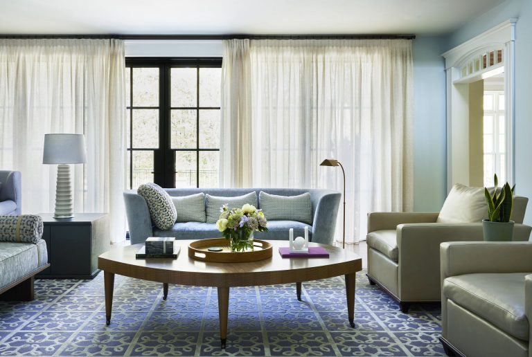
Design Brief
Follow along for an in depth portrait of a recent project that stirs together
a contemporary lifestyle with traditional elements. The clients engaged us
after being in their new home for a year. The French Country style home, which
was built roughly in 2000, had finishes and fixtures that the clients wanted
to change in addition to updating its home technology and architectural
lighting. We were engaged to design the living spaces to express their style
as a couple with comfortable, relaxed, elegant rooms for the family to enjoy
together. Like many couples, their personal tastes and color preferences
differ.
Foyer
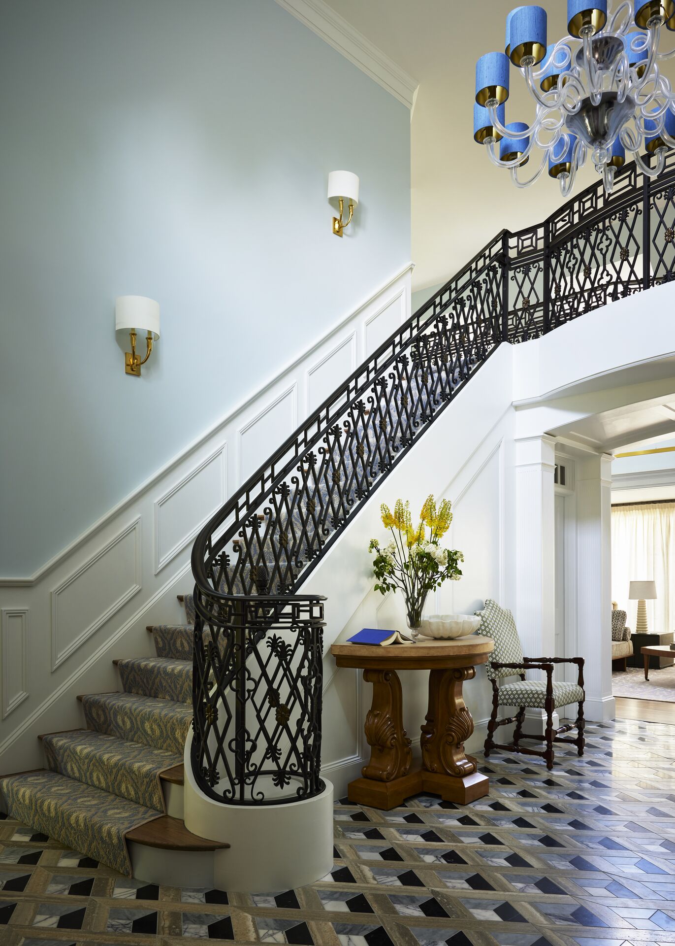
Platemark custom designed the metalwork stair rail and the trompe l’oeil
marble tile floor.
Challenge
Because the foyer is an expansive two-story space, it sets the tone of the
home. Without appealing elements indicating that it is a usable space, it
served more as the home’s central corridor. Not surprisingly, the family used
it as a passthrough.
Solution
In the pursuit of refining the ambiance, texture and aesthetic of this
space, we carefully assembled every facet of the foyer — now an exquisite
entryway that goes beyond simple passage. It has become a definitive room
with multifaceted functionality, particularly when hosting guests. The
staircase, now an architectural accomplishment, underwent a metamorphosis,
as we replaced the underwhelming rail with intricate custom metalwork,
elevating its purpose to be a grand focal point.
Expanding on this substantial improvement, we designed and selected the
marble tile floor, laid in a trompe l’oeil pattern, giving the instant
illusion of depth and classical tone. Illumination took center stage, with
the former chandelier making way for a sparkling Murano glass piece, with
the ability to ascend and descend at will. Sconces, too, were replaced with
this upgrade.
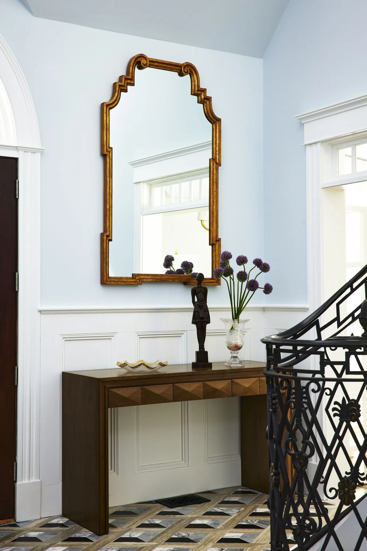
The stairway narrative continued with meticulously stained treads and the
addition of a new runner, seamlessly extending to the upper floor and through
to the hallway. A carefully chosen paint hue interconnects the upstairs
corridor and family room, and also serves as the unifying thread weaving
together the disparate spaces. To further embellish the aesthetics,
wainscoting was introduced, and practical elements seamlessly integrated —
functional seating, consoles and decor, each contributing to the harmony.
Family Room
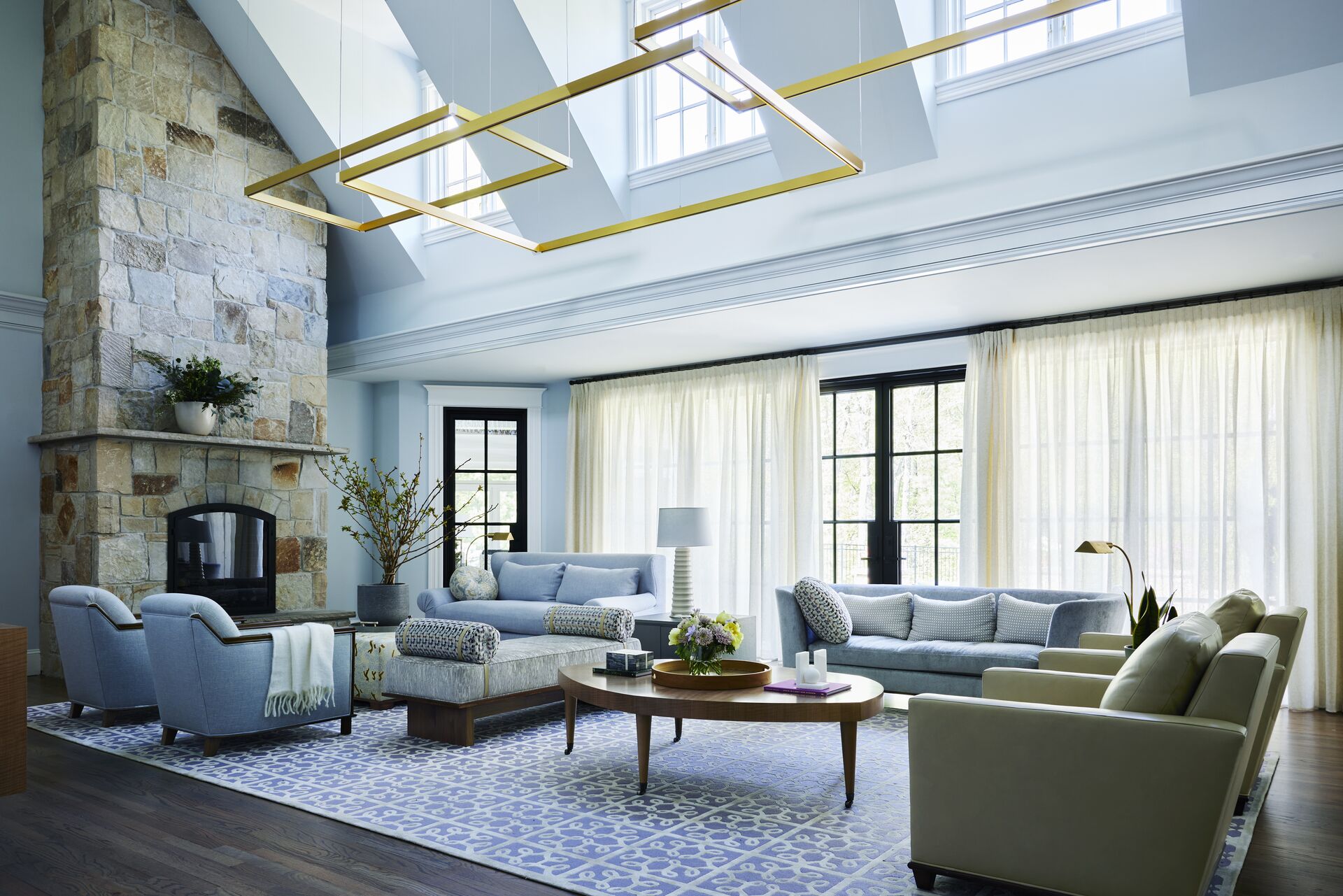
- Platemark custom designed the chandelier to span the room and reduce the
perceived ceiling height.
Challenge
Navigating through the room presented a challenge, as numerous pathways
needed to remain clear, a task made intricate by the fact that this space
serves as the primary family hub. The room’s initial layout centered around
a pre-existing built-in entertainment center designed for television
viewing. The clients preferred to use this room for reading and socializing,
and the home theater or game room for movie and television viewing.
Architectural intricacies such as dormers, detailed finishes and a
pronounced chimney breast only heightened this effect.
Additionally, the views of the garden, which had the potential to integrate
the space with natural elements, were obscured. Increasing the challenge was
the room’s soaring two-story ceiling, which, rather than conveying a sense
of warmth, felt more imposing and chilly. Architectural details, such as
dormers, finishes and the prominent chimney breast, only accentuated this.
Solution
Approaching the challenge, we envisioned the space as more than just a room
but as a refined lobby where multiple seating areas, custom upholstery, tables
and casework would redefine its purpose. A colorfully crafted hand-tufted rug
envelopes these distinct seating zones, while the floors underwent a
refinishing and staining to mirror the elegance of the foyer’s stair treads.
Where the now-removed entertainment center stood, two floating consoles we
designed were introduced. An improved, more seamless connection to the garden
was forged by replacing the French doors with steel windows and doors, now
effortlessly opening outward. The addition of soft, billowy curtains
accomplish the desire for privacy and light control.
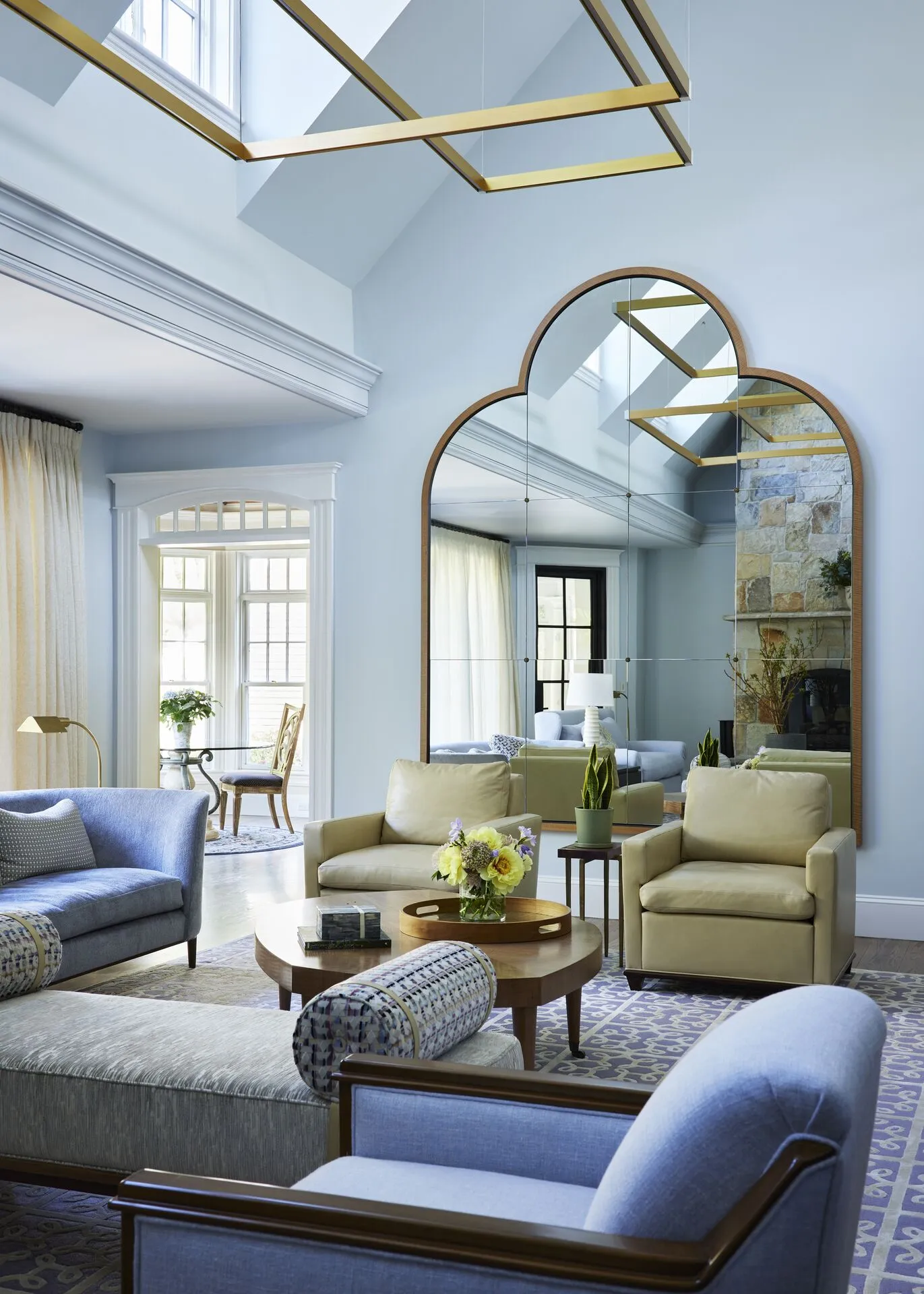
Introducing another element to balance out the room, we designed a mirror
strategically positioned to reflect the fireplace, while increasing the
presence of garden views. To mitigate the perceived height of the two-story
ceiling, a linear LED chandelier now hovers above the living area. This
solution effectively reduces the vertical expanse.
Molding replacements and strategic removals further improved the visual
transformation with additions of the uplighting and recessed lighting. The
chimney breast underwent a stone cladding process to match the existing
fireplace, and other architectural elements throughout the home’s exterior,
giving it a more structural feel. The addition of a new stone mantel and
custom fireplace doors punctates the now-refined fireplace surround. Lastly,
the paint scheme, a final stroke of unifying this room, was simplified to
further downplay the ceiling height.
Dining Room
Challenge
As with most projects, the dining room’s dimensions inform the size of the
dining table, chairs and serving furniture. In this instance, the clients were
using antique furniture from a previous residence, scaled much too large —
which resulted in a room that felt overcrowded and less approachable. As a
room that was used to celebrate the holidays and for special occasions, the
clients wanted to maintain its more formal use, but also wanted to update its
traditional New England design scheme.
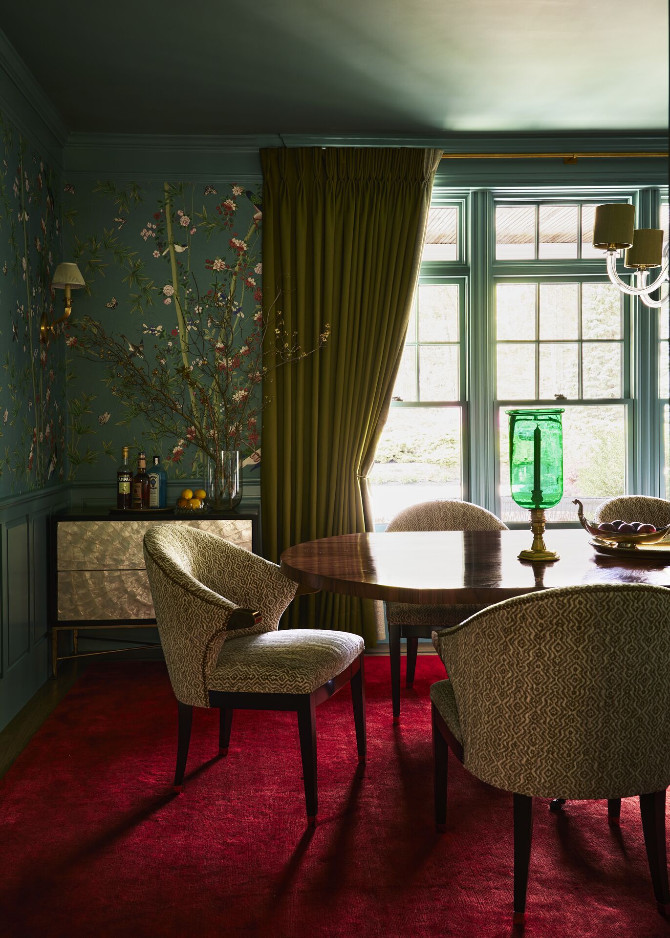
- The rosewood dining table was designed to fit the room’s size as was a
custom deep blood orange mohair rug.
Solution
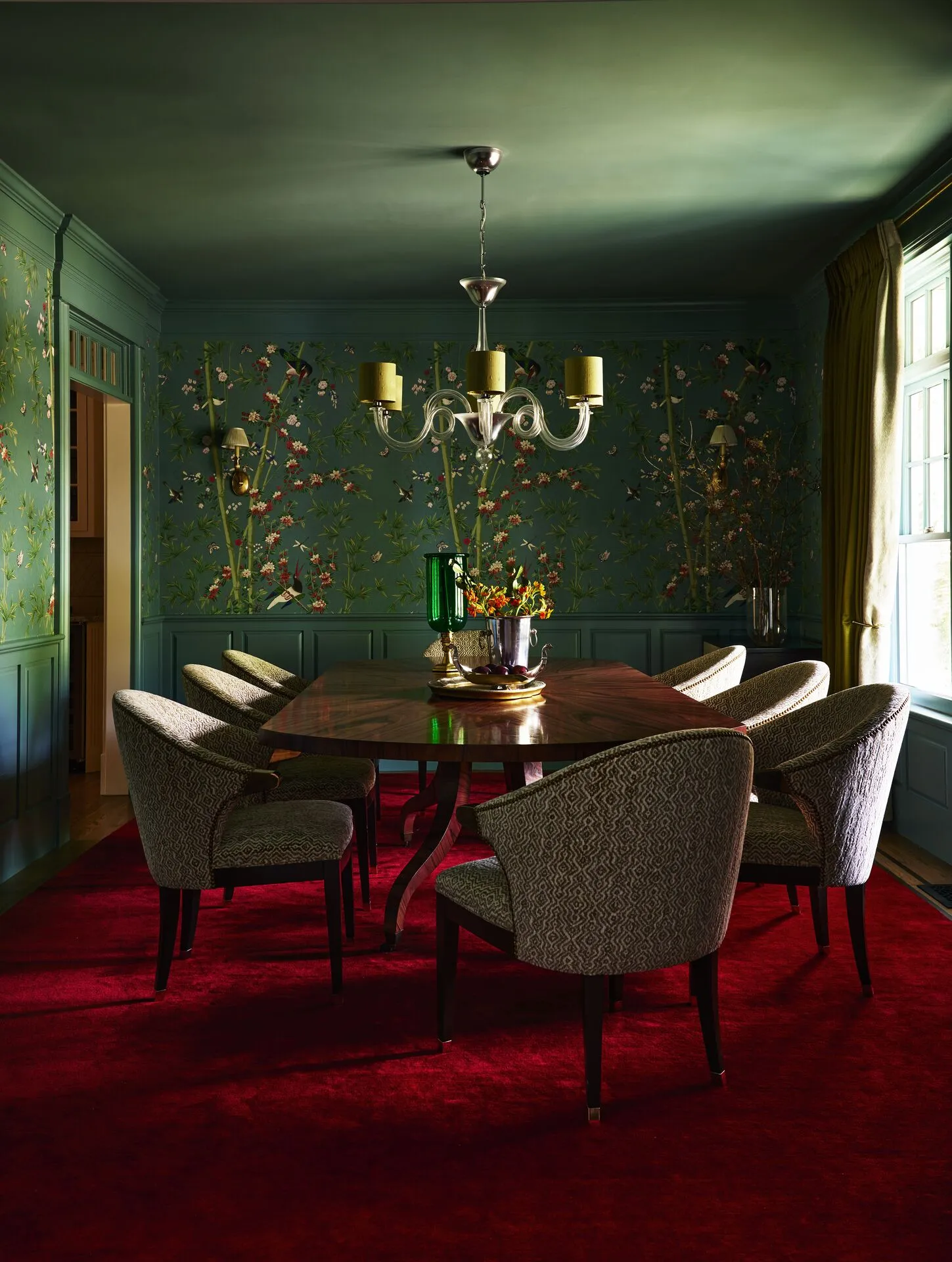
Taking cues from the clients’ style preferences, we blended Traditional and
Contemporary furnishings with a fresh color palette and lush finishes to
imbue the room with energy and a relaxed elegance. A show-stopping rosewood
dining table was custom designed to fit the room, and is surrounded by
custom barrel-style upholstered armchairs that are extremely comfortable.
Two small capiz shell buffets offer storage, additional serving areas and
keep the room feeling open. As with all the rooms, lighting was
substantially improved with a combination of decorative sconces, recessed
lighting and a beautiful Murano glass chandelier.
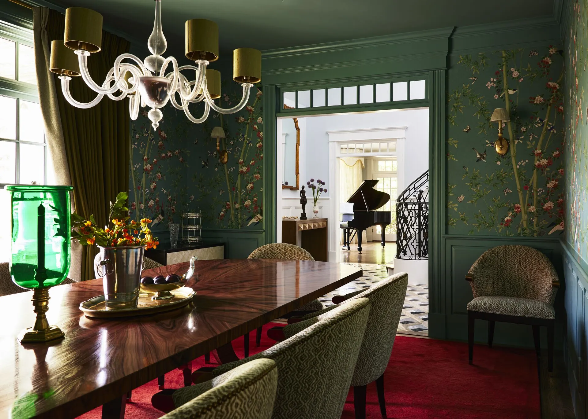
Vibrant chinoiserie wallpaper panels were hung above the wainscot, and the
millwork and ceiling were painted to match its color ground — a very bold
design decision. Most impactful element in this room is the custom mohair rug,
dyed to a deep blood orange color, making an extraordinary statement and
rounding out the room’s unmistakable character.
Living Room
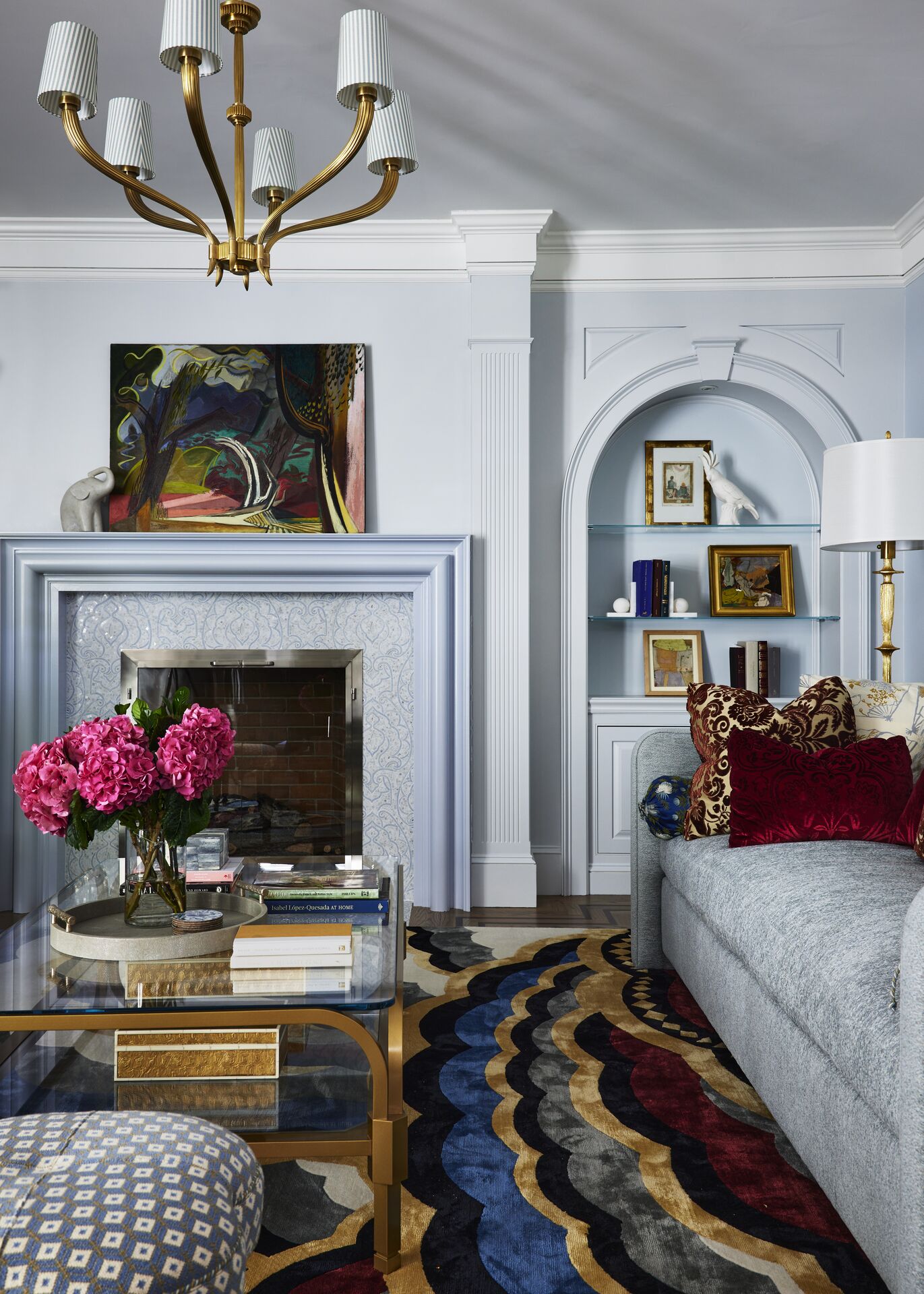
- Platemark designed the fireplace to anchor the seating area as well as the divan-style sofa and glass coffee table.
Challenge
The clients’ traditional New England furnishings and rug from a previous
residence proved to be improperly sized for the room. The need for more
seating and an overall refreshed aesthetic is what prompted our clients to
seek a redesign.
The clients’ traditional New England furnishings and rug from a previous
residence proved to be improperly sized for the room. The need for more
seating and an overall refreshed aesthetic is what prompted our clients to
seek a redesign.
Solution
To counterbalance the large, black piano, we sought to redefine — but not
overly so — the center of the room. Simplifying the millwork around the
fireplace, we designed a more substantial mantel to anchor the seating area
and rebalance the room. We replaced the fireplace surround and hearth with a
lovely, muted mosaic tile while making over the fireplace with finer
fireplace doors.
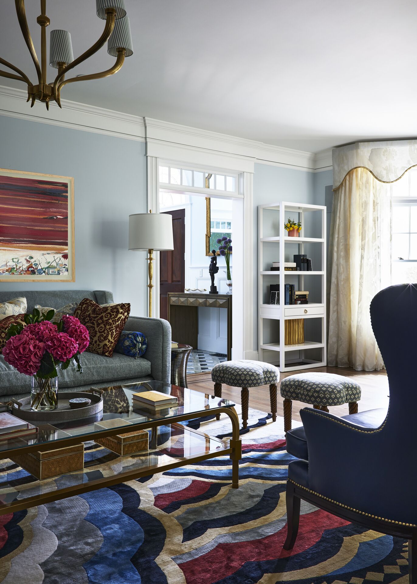
A large divan-style sofa, ottomans and contemporary leather wingback chairs
form the essential seating group for this room. A Platemark-designed tiered
glass coffee table keeps the room feeling open and directs the eye easily to
the fireplace. However, the true (un)hidden jewel of this room lies beneath
— a remarkable silk and wool rug, artfully crafted in its vibrant and
graphic design. This rug, echoing that of the dining room, has a similarly
deep saturation, yet is a bit less restrained because of its graphic nature.
For further unification and functionality, we added glass shelves and
strategically placed lighting in the recessed arches. The large bow picture
window, needing softness and filtering from the sunlight, we fashioned in
billowy, bright curtains, topped with a contoured valance in a serpentine
shape. The living room now is quite exquisite and welcoming.
Like what you’re reading? Stay in touch with monthly (or so) e-mails.